
A gaze on colour
And driving commerce

London’s Science Museum Group released a piece of research in 2020, analysing over 7,000 photographs of objects. I’ve seen this often quoted and generalised by brand strategists and creatives as a decline in colour everywhere over centuries. A lament over the world being less colourful. And whilst this may be true across 21 categories in object design… certain categories are emerging as defiantly and enticingly colourful.
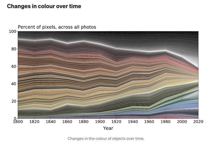
Image credit: London Science Museum Group
i. candy-coloured wellness
Earlier this month I visited New York for a whirlwind five nights and walked into The Travel Agency. A gallery-like cannabis dispensary. More than the novelty of it all, as an Australian, it had all the right directional signage copy:
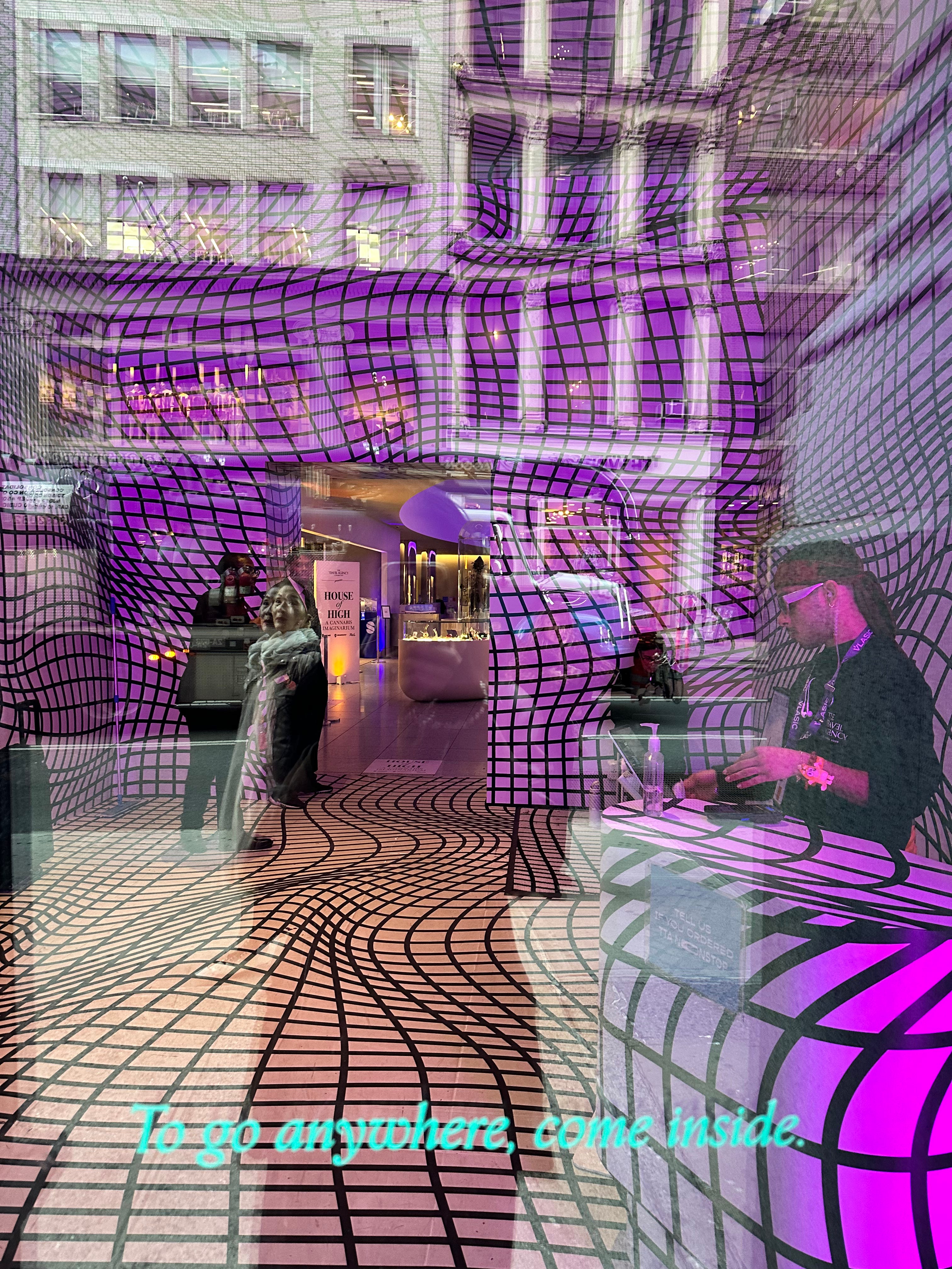

I’m more than obsessed with the riff on travel and how this retail business elegantly presents escapism. Cannabis has become premium and The Travel Agency is appealing to a new tier of customer. Unwinding, unravelling or feeling upbeat is now elevated. A covetable luxury item.
What also struck me is how edible packaging is embracing colour and really leaning into “little treat culture”:
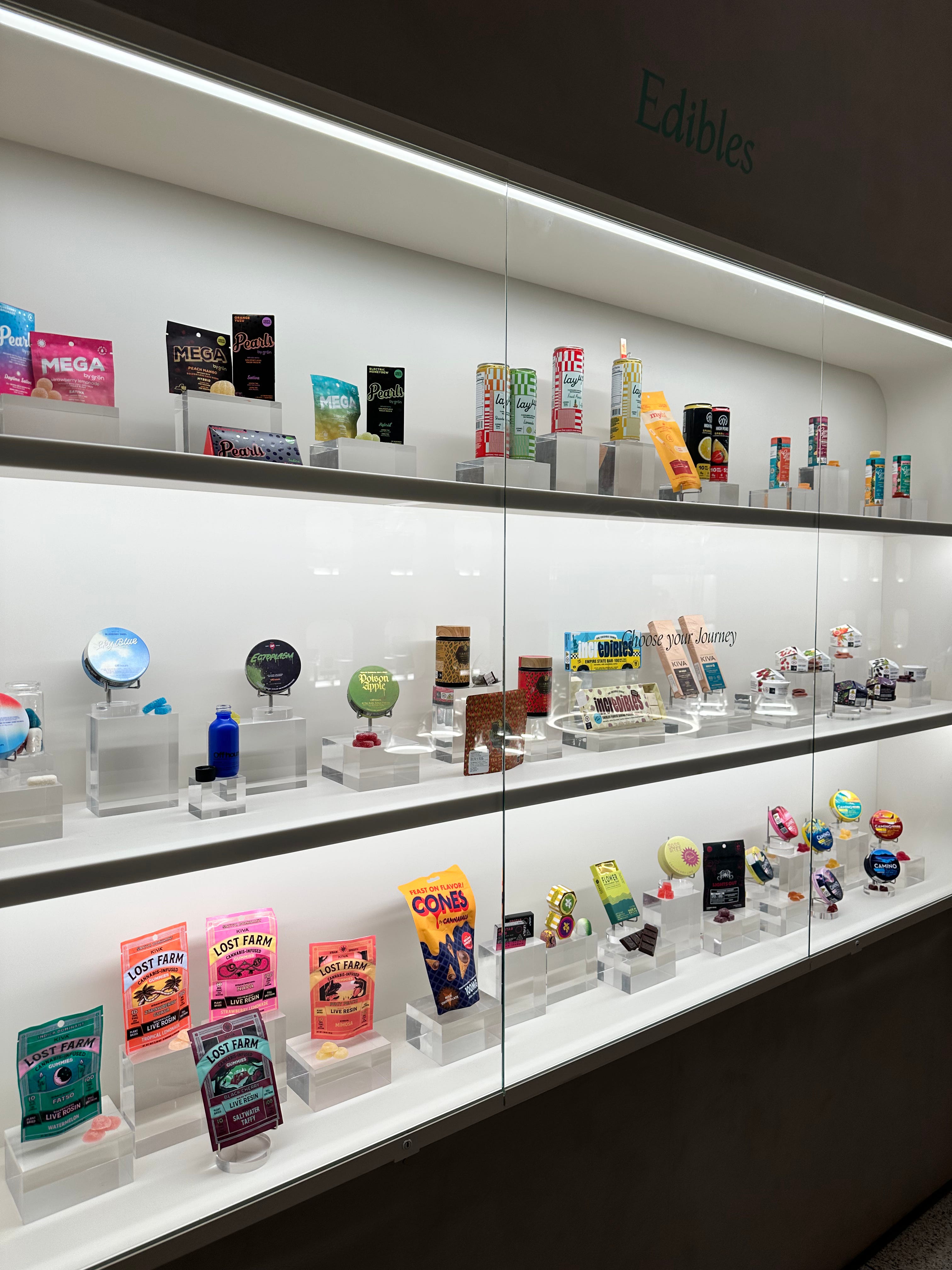
Which begs the question, is colour our threshold to permission? Is colour a portal to enter a childlike state, where we had moments to indulge without consequence?
Or is colour linked to ownership?
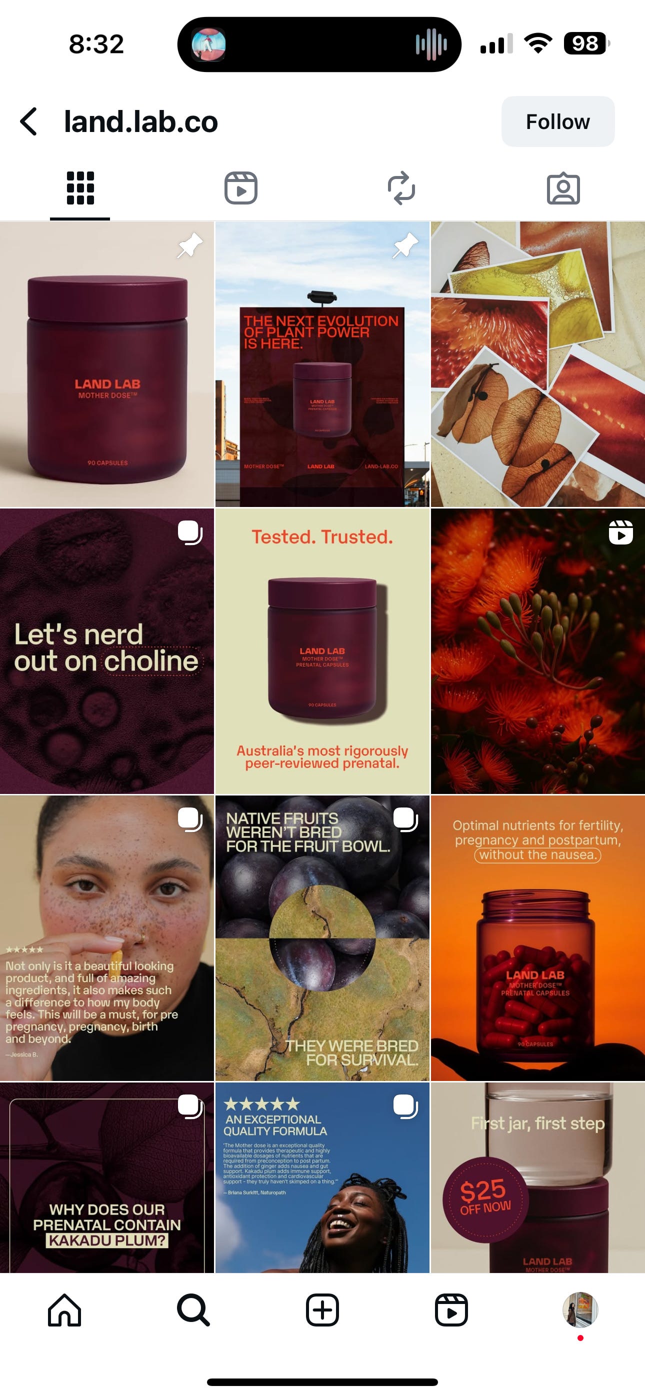
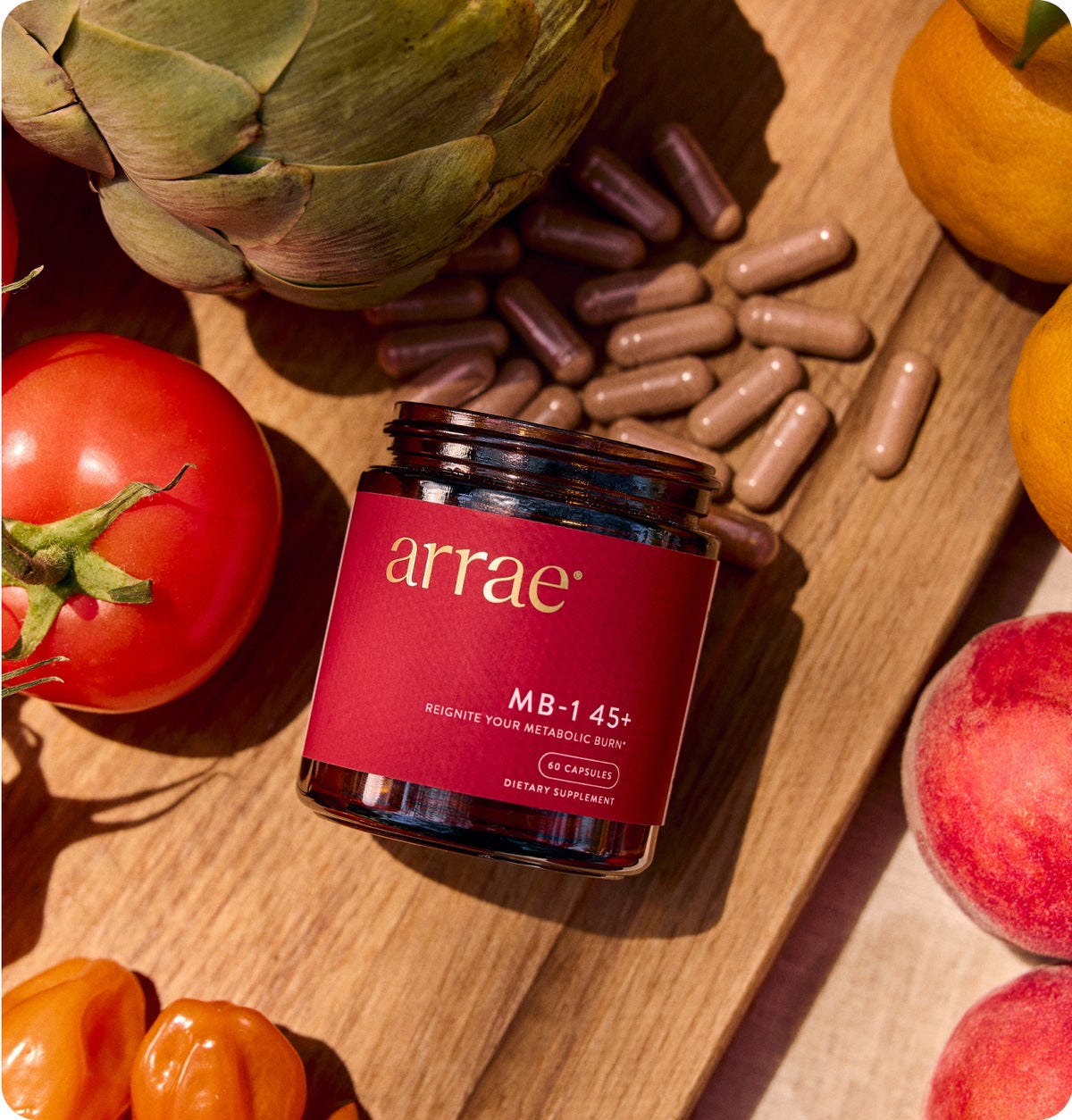
When I consider other areas of wellness – particularly in women’s supplements for pregnancy and perimenopause, I’ve noticed deep and rich colours used for branding and packaging. A couple of brands come to mind – LandLab is an Australian prenatal supplement business and Arrae. Notice the burgundy tones – literal representations of blood at times when menstruation is paused or declining. It’s not so obvious when you isolate the brands and products. It feels comforting and familiar without people really understanding why. Burgundy feels natural, non-threatening and acceptance of how things are. Burgundy is holding space for times of change.
And then there’s Vida Glow’s natural marine collagen. Candy coloured sachets. A visceral experience to rip one open compared to collagen supplements that come in oral capsules. There’s commentary about the wastefulness of it all, a one by one foil sachet. But colour here is more than permission to escape or even body ownership. It works similarly to coffee pods. Colour feeds our now. And our desire to consume singly. For one minute or two, I/we don’t want to be responsible for anyone else, the planet, the consumption impact, the responsibilities, the questions, the ethics, the right answers. Whether there’s efficacy on the surface, colour lets us have self.

 | Harrods US")
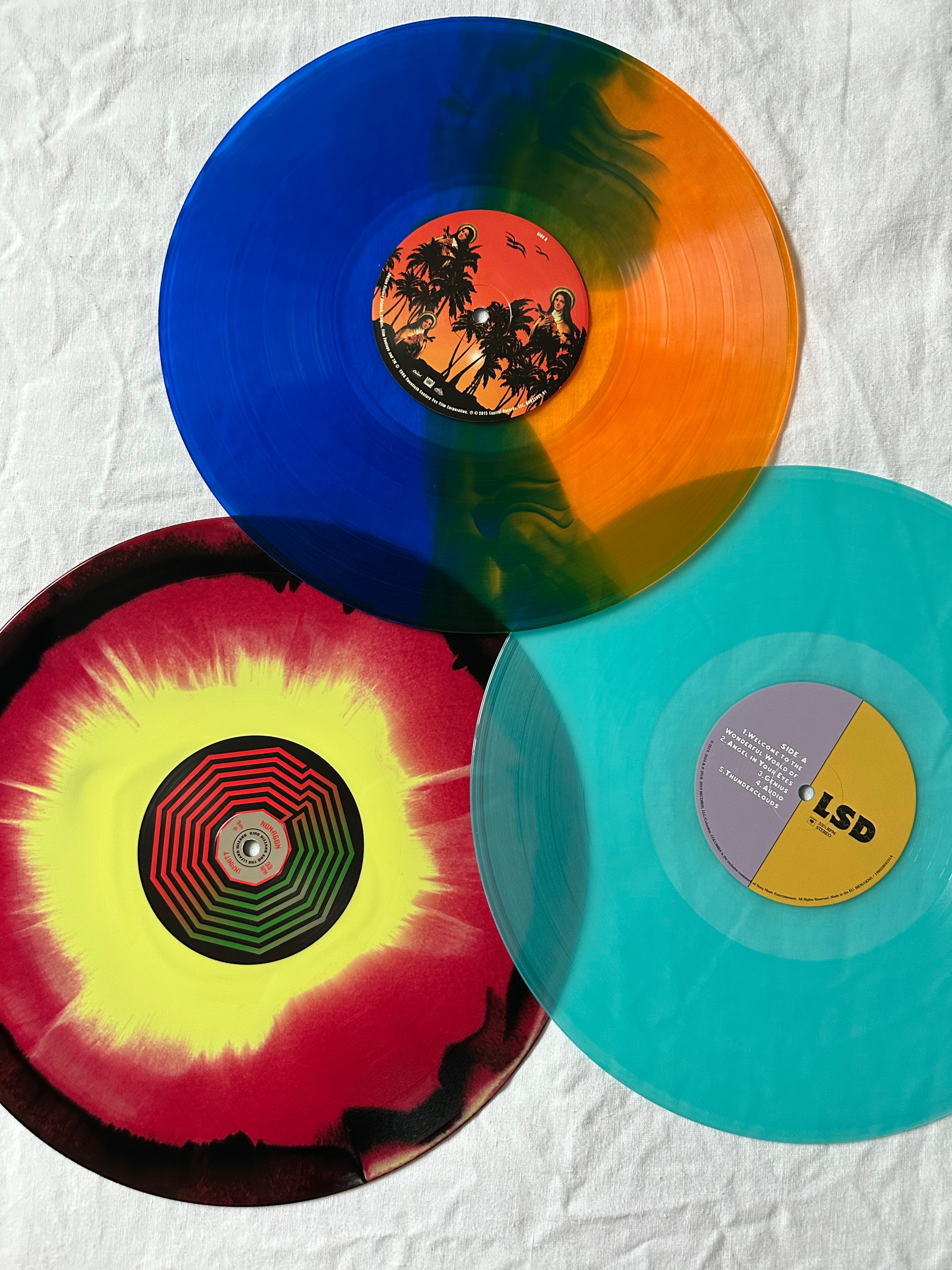
ii. colour-driven vinyl sales
An old article on Hustle.co about the resurgence of vinyl combined with a number of reddit forums about coloured records being targeted towards cashed-up Millennials or any demo, tells me it’s more than a sign of consumerism.
The role of colour driving vinyl sales is important because we’ve lost anchors in music. On a fundamental level, vinyl is bringing us back to marking time in an artist’s album. Streaming has meant we no longer recall songs by their track number and place in the album. Yet vinyl allows us to recall at what point we need to flip the record to keep playing.
iii. today’s painters
In New York I booked a couple of private gallery tours with Merrily Kerr – a guide to the inside art scene. I toured with her in 2007 and was fortunate to see Mike Nelson’s “A psychic vacuum”. Signed an NDA to navigate a labyrinth of doors and tiny rooms which opened up into an expansive field of sawdust. Pre-iphones and Instagram, his work was a memorable, painstaking diary.
18 years later, I got lucky with timing again. A lot of shows opened the week I was in New York and they happened to be all female, mainly painters:
Merrily told me that the art market had suffered the last couple of years but was climbing back and it showed in the work. There were a number of commercially-led, pop colour pieces – easier to attract buyers.
But the painting I cannot get over is by Katherine Bradford, an 83 year old American painter. She’s known for a figurative style of painting where the average person would say I could’ve done that. On the surface, the paintings are striking colours, but every choice is deliberate and symbolic:
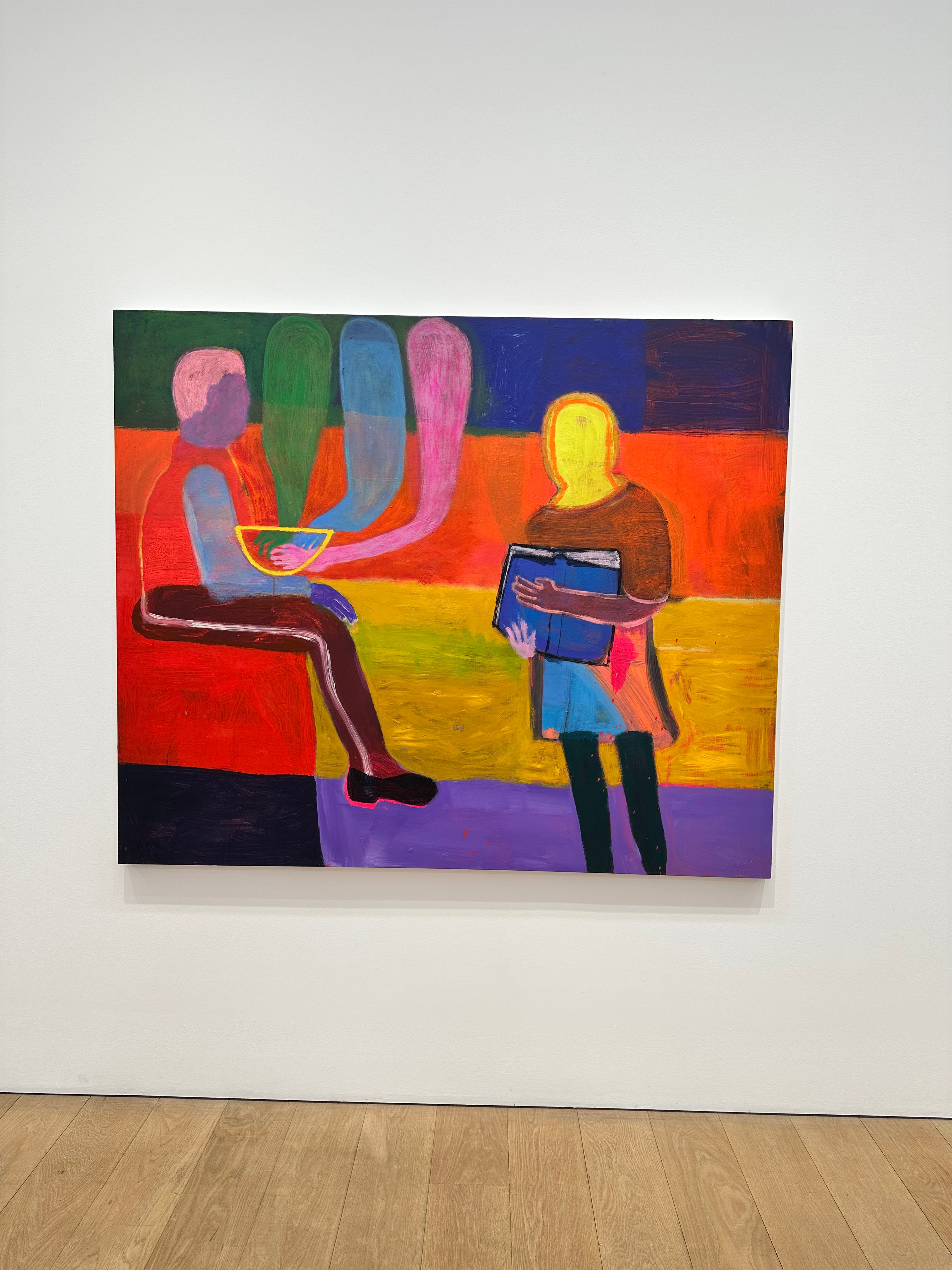
This piece is called “The Gifting Bowl” and there are many layers to unpack.
The seated figure appears to be a boy with a bowl he isn’t holding, but is placed in his lap. The figure showing the book is not an adult.
The bowl may not be physical and is the same colour as the girl’s face. Her hands, are they tentative?
…
Art mirrors our times.
And from what I saw across two tours, four hours, was extraordinarily colourful, almost falsely optimistic or naive-looking works to avoid deeper scrutiny. Perhaps colour here is a mask to avoid the wrong attention.
A couple of weeks ago at a nail bar in Sydney, a woman sat next to me from Atlanta Georgia. She was at the tail end of a three month cruise and we spoke about the US. How fraught everyday situations can get. She mentioned when driving and pulling up to a set of lights, she looks to the car on her right and left to temperature check. There’s so much road rage. And you don’t know if they’ve got a gun.
Is colour in today’s art a pacifier? To not antagonise. Especially in the commercial, pick me pieces waiting to be bought.
Because the meaning is there if you have patience to look.
Js.